Case Study
Property search web app

Overview
-
Perfect Properties is a web app for beginner investors to search for investment properties
-
Part of the challenge was to give users comprehensive information, while also providing a very user-friendly experience that would not be intimidating to small-scale new investors
-
This was made as part of a UI specialization for my Immersive UX Design Course, and a project brief was included
What I did
-
Created a design system including icons, typography, and color palette
-
Created prototypes and wireframes from low-fidelity stage to high-fidelity.
Competitive Analysis
-
I started by checking out popular real estate platforms both on mobile and on desktop
-
Some of my main focuses were to take a look at
-
Overall layout
-
Filtering experience
-
Home page
-
Saving features
-
-
Some key takeaways:
-
There was a lack of a home screen that felt like a home-base dashboard where you could see recently viewed properties or saved properties
- Many navigation bars didn't have a "home" button/icon but instead, the default screen was the search feature
-
Many used the map screen as the main home screen, which isn't particularly useful as a starting point, and could be overwhelming to users
-

User Personas
-
This persona reflects one of the main use cases: middle-aged people who have been interested in property investing for a while but need a simple and easy tool to search and save
-
Keeping Diane in mind helped inform decisions throughout the design process

Initial sketches and ideation
After taking a close look at what existed, I hit my notebook to mark down some initial ideas and sketches to begin thinking through screens and user flows related to filtering searches, and viewing properties.


Mid-fidelity wireframes
Taking into consideration the project brief, existing real estate apps, as well as conversations with some other designers and some users of real estate apps, I began working on the first digital wireframes in Sketch.

Feedback
After showing initial wireframes to users I found:
-
Some did not like the way of choosing property types
-
People would rather scroll through photos vertically than clicking through slides horizontally
-
People appreciate a home screen that is useful but not busy
Moodboard
-
I searched for inspiration and referenced the project brief to create two mood board options that aimed to capture the appropriate imagery to use, colors, tone, and font
-
I ultimately went with #1 because:
-
The use of red on #2 did not fit with the professional yet peaceful tone that would help provide a comfortable app experience
-
Talking to people about what they expect from a property search app revealed that illustrations and cartoons made it feel less real and seemed a little gimmicky, whereas the real photographs made it feel more professional
-
Moodboard #1

Moodboard #2

Style Guide
Then I applied these themes to the wireframes and created the ever-evolving style guide which included:
-
Typography
-
Colors
-
Button Design
-
Icons
-
User Input

Second iteration of wireframes
All of my findings along with the moodboard and style guide informed the iteration of the wireframes, leading to the versions below

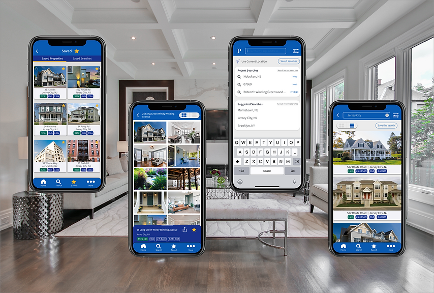
Final mockups and wireframes
With feedback from users as well as some designers, some changes were made in the color palette and button hierarchy and led to the final mockups below

Still to come
-
Animation